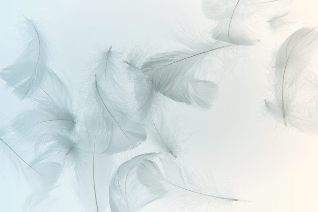
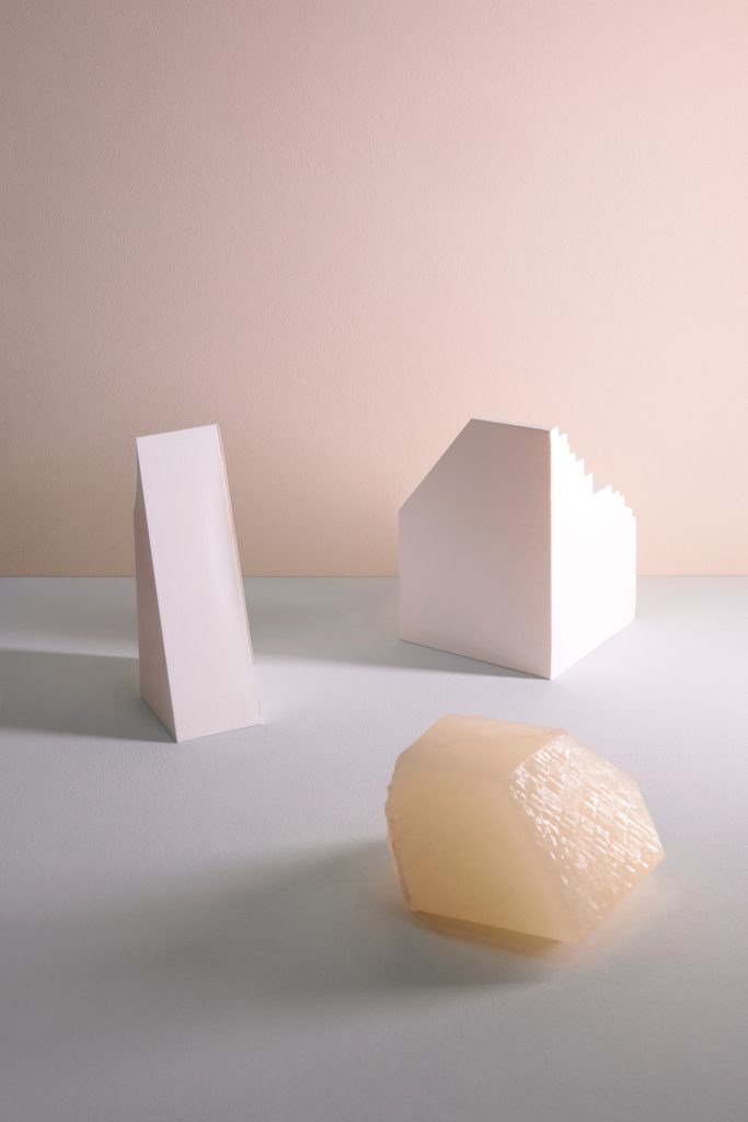
Clean and considered, this month’s palette features a selection of hues designed to reassure in health and wellness environments. Calming throughout, a soft yellow and optimistic pink bring warmth and comfort. Gradating towards cooler hues, a gentle gray, clear blue-green and our 2021 Color of the Year, Simple Serenity gently uplift.

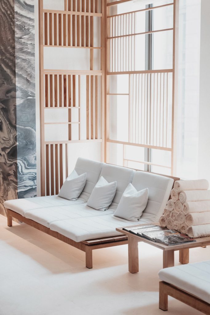
Softly welcoming, an optimistic pairing of Sweet Buttermilk and Drifting Tide make an ideal combination for reception areas in spa and wellness facilities. Partner with warm spotlights, light woods and mosaic-tiled features in tonal hues to create an entrance to relax guests.
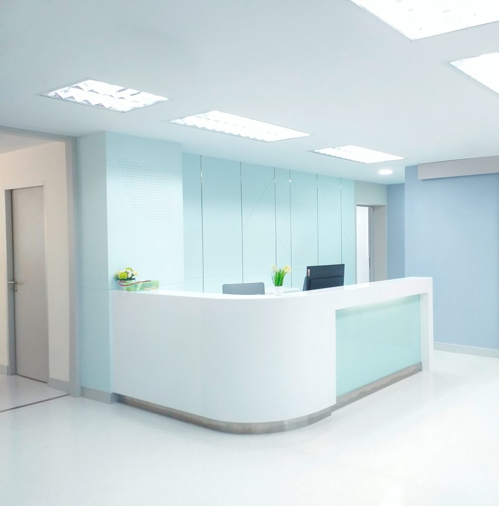
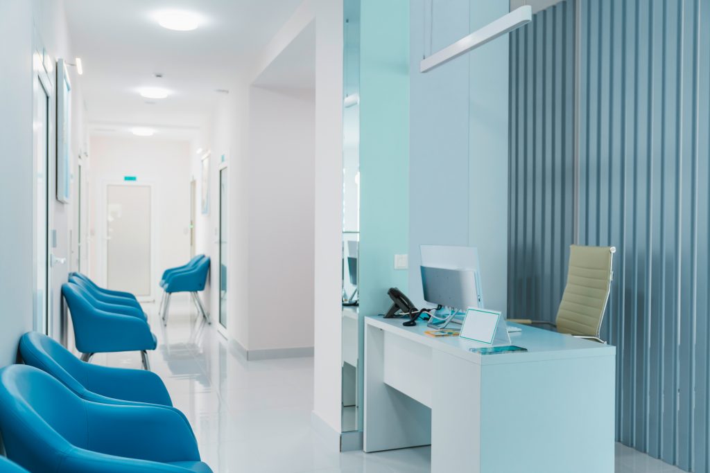
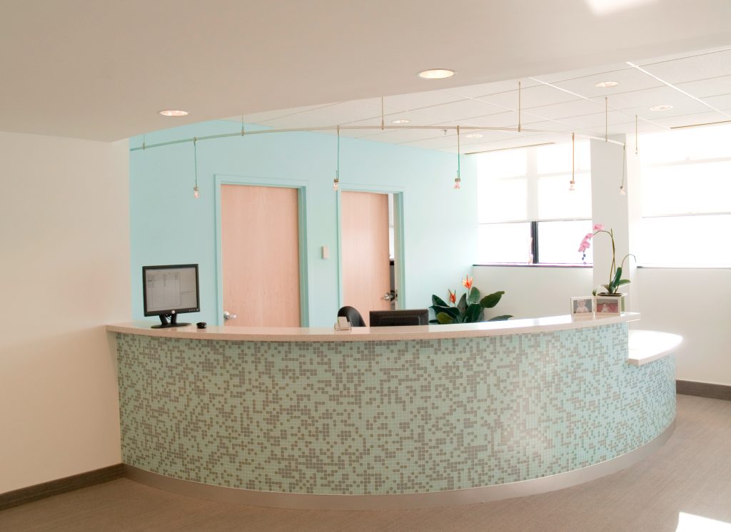
The palette’s cool and clear shades, Simple Serenity, Drifting Tide and Angel Kiss are ideal for healthcare environments. This tonal harmony brings a real sense of clarity and reassuring cleanliness, designed to support and alleviate anxiety.
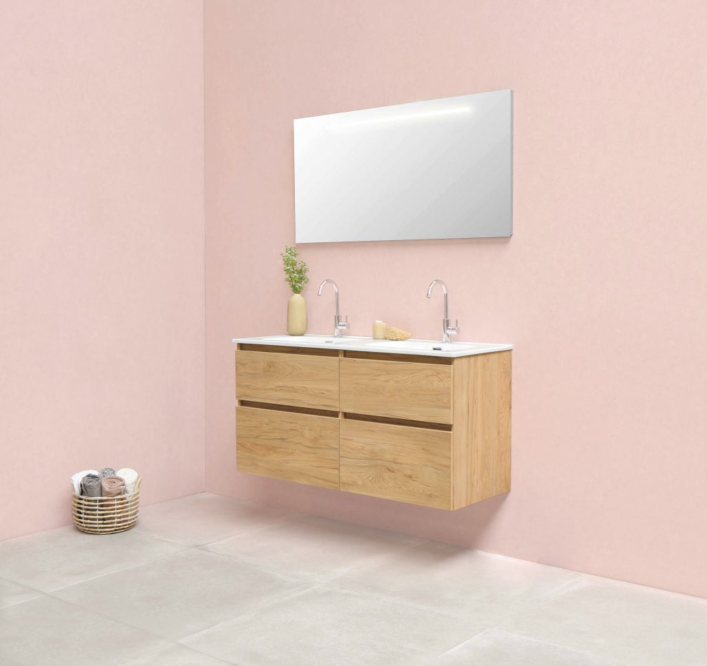
For guest and public restrooms opt for Pale Shrimp. Calm, and yet uplifting, this natural pink works well as an all-over color scheme. Finish with modular fixtures in warm, light woods and considered accessories for a modern outcome.
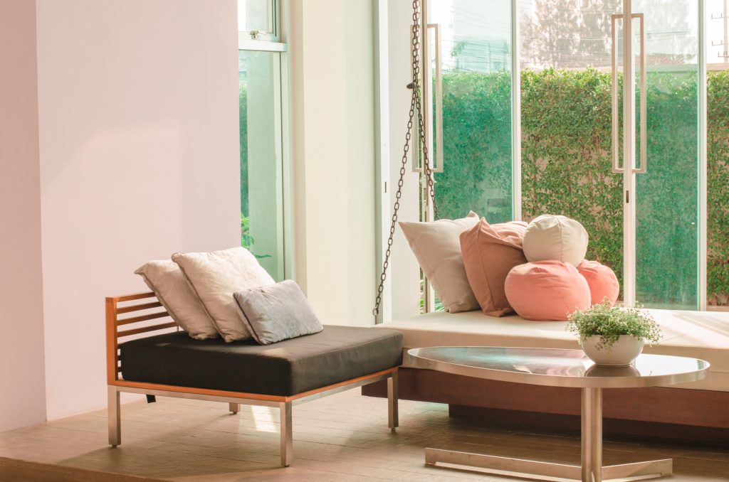
Waiting rooms can often feel stark and cold. Instead, create a comforting atmosphere with a combination of hues that soften and bring a gentle warmth to spaces. Here, Sweet Buttermilk and Pale Shrimp work as neutrals and create a meditative glow. Elevate a mood of ease and relaxation with plush cushions and views of natural foliage.
In creating calming environments for spa and wellness retreats or updating waiting areas and receptions for healthcare and clinics, color is a powerful tool. Designed to positively improve mindset and wellbeing, this month’s palette of soothing hues will ensure clients and guests feel relaxed and reassured.
In our next article we’ll be breathing new life into those outside spaces, focusing on updating your exteriors for the warmer months ahead.